What's in a magazine cover
- What is a font? Font is the style of writing that the text is written in (comic sans, times new roman etc)
- What is sans-serif font and serif. What are their differences and their advantages and disadvantages? Sans-serif font is a font where all letters are written with the same width whereas serif uses ranging width of letters for asthetic purposes which also include brush strokes at the ends or tips of letters. The advantages of sans-serif is that its easier to be recognised and won't cause any confusion on what the letter could be, however its also very simple which makes it look bland and boring. The advantages of serifs is that its more visually appealing.
- Why do magazines use a variety of fonts and colours? Magazines use a variety of fonts to emphasise different parts of their covers which they would want the audience to see first. The use of different colours on covers is used to create a matching contrast that stands out and draws a wider audience.
- What is a complimentary colour? A complimentary colour is a colour that matches another colour to create a more appealing image.
- What is an analogous colour? Analogous colours are groups of three colours that are next to each other on the colour wheel with one dominant colour.
- What is the masthead? The masthead is the large title of the magazine placed on the top of the magazine.
- What is a main cover line? Are the main text usually in the middle of the cover that focuses on the main subject that the magazine is writing about.
- What is the left third and the right 2/3? These are the proportions of the magazine covers. The right 2/3 is the right side of the magazine that contains most of the image of the cover and the left third is where the topics of what the magazine contains.

This was the layout of my magazine that I wanted the end piece to resemble. This first template was very basic and only included the style of the headline I wanted to use, the place where I was going to put in the bar code at the end of the design. I started to think of some of the titles I wanted to put on the front page.

On the second draft I added a background colour. I started with a background that was a single shade of blue but it didn't look appealing so I used a tool to show a mix of shades. I added more titles on the sides in different fonts and colours. I added a barcode in the bottom corner.
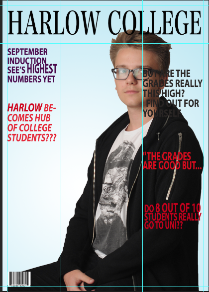
This was my final design for my magazine layout. The background from the previous design was too dark, so I used the same fading design but I used a much lighter shade of blue to resemble the magazine I based mine on. In this design stage I added my profile photo. I used the magic brush tool to erase the white background from the photo. I should've brought the photo in front of the text and moved it slightly towards the middle.
